
I love Aby Warburg’s ideas of re-establishing pathos: an interview with Amie Dicke
-

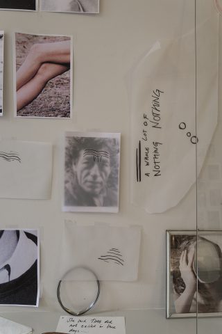
- Studio Amie Dicke, December 2015. Ph. Charlotte Luijendijk.
-

- Studio Amie Dicke, December 2015. Ph. Charlotte Luijendijk.
-

- Studio Amie Dicke, December 2015. Ph. Charlotte Luijendijk.
-
- Studio Amie Dicke, December 2015. Ph. Charlotte Luijendijk.
-

- Studio Amie Dicke, December 2015. Ph. Charlotte Luijendijk.
-

- Studio Amie Dicke, December 2015. Ph. Charlotte Luijendijk.
-
- Studio Amie Dicke, December 2015. Ph. Charlotte Luijendijk.
-

- Studio Amie Dicke, December 2015. Ph. Charlotte Luijendijk.
-
- Studio Amie Dicke, December 2015. Ph. Charlotte Luijendijk.
-

- Studio Amie Dicke, December 2015. Ph. Charlotte Luijendijk.
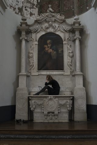
Artist Amie Dicke talks about iconography in art, religion and advertisement at her studio in Amsterdam, located in a former neo-classical Catholic Church – with a neo-baroque façade – founded in the late 19th century. The signification of the image and the reflection on its power is constantly present in her diversified body of work, which explores the tensions and polarities of presence/absence often depicted across the possibilities of photography. The interview has taken place on the occasion of a studio visit during the time of her research at the Foundation Castrum Peregrini, for which the artist explored the house, interiors and objects of Gisèle d’Ailly van Waterschoot van der Gracht and the history of the location that encloses them.
When did you move to your new studio in the Church De Duif at the Prinsengracht in Amsterdam?
In early 2014. I’ve been here since two years.
I heard it was one of the first non-protestant churches of The Netherlands, built in 1858 by the architect Theo Molkenboer. How did you happen to move here?
I was very lucky. There isn’t any other studio in the building. I am the only one working here. In the late seventies the Church De Duif was in such a bad state that it was threatened with demolition by the local government. Many houses along the canals were deteriorating and a lot of buildings were falling apart. Therefore, some people started to squatting them. In this case some parishioners preserved the church until some years later the foundation Stadsherstel (city restoration) became the owner and renovated the church, ensuring the character of the building was left intact and opening the space for events and cultural projects. Stadsherstel gives to historic buildings a new use and meaning, but they are also responsible for their maintenance. Later on, they offered me a place to stay.
How do you feel to be in a former Catholic Church? Do you work in the nave and chancel sometimes?
Yes, also because the internet is much better at the altar. My studio is located in the former sacristy. I have a door that opens to the church and you immediately stand next to the altar. Each time that I enter my studio’s front door, at the back of the Church, I can feel the curve of the altar. I have to deal with this building and see it for what actually is. It becomes a part of the daily surrounding.
In your window is written ‘Meet me at the Altar’, when and with whom do you use this sentence?
I’ve chosen this sentence as a title for few meetings and talks that I organized here. In these meetings we discussed about the work, not necessarily mine, and about the process of making art and construction of meaning.
Did you grow up in a religious environment?
I grew up in a Pentecostal Church, with no images or ornaments. In that church the invisible plays an important part; for instance the speaking in tongues, the holy spirit, etc.
Now, being in a former catholic church is completely different, so full of images. I find ironic that I ended up here.
Imagery is of course very influenced by religion, the icons and the ritual use of objects. How these images were formed was very much related to their placement and their need to tell (or translate) a story. The same mechanism is applied when we see a painting, an altar piece, or even a piece of advertisement. Our essential feeling is still of curiosity towards the image. What is it telling us? That’s why I used a lot of magazine pages; I feel that there is some essence of beauty in them. On the other hand, I find them really superficial.
But I like to trace it further back. It makes me think of this quote: “Revelation was a visual category before it was a religious one”, I think by John Berger.
Were you thinking of highlighting this superficiality when you (re-)used fashion magazines in your past works? For example, in the work where you hit with nails the face of a model on a cover of Vogue magazine. Is the process of signification and/or communication that interests you the most?
I used fashion magazines because I think they are interesting in their eye catcher demeanor of the selling process. I want to understand how an image works in terms of semiotics; its signifiers, interpretation, visual meaning, the language and communication system. How images are thus interpreted and used.
When did you start with these works based on fashion magazines?
I started to make these works in 2001 while I was living in NY. I moved there after graduating from the Willem de Kooning Academy in Rotterdam in 2000.
New York was overwhelming, with its pace and the enormous billboards everywhere.
I did have neither wifi at my place, nor a mobile phone. I started to be really disconnected from my hometown Rotterdam and I tried to find a new way of living in the US. The billboards for me where the perfect focus point of navigation in the, for me then, new city.
At the same time these images embodied the aspects I dislike: the never ending rush, that over focus on commerciality. I was really obsessed with the concept of the promise of beauty, a promise that never gives. Cutting away parts of the images was a way to reflect and the created emptiness gave me the space to place my questions.
How do you make use of the possibilities of the medium of photography?
For a new book, Erased Lamppost, I worked with found photographs from the Merkelbach Collection. Merkelbach was a portrait photo studio based in Amsterdam from 1913 until 1969. More than 40,000 portraits on glass negatives were taken there. These are now stored in the Amsterdam City Archives and can be viewed online.
The glass negatives from the last century are now the digital images on the glass of my screen. I looked at the photos one by one, zoomed in, all from my laptop in my studio.
My gaze soon shifted to details. The more I looked, the more the faces disappeared into the background. In this way I discovered casual onlookers and unintentional portraits. From hands in pockets to a woman looking out of the window inquisitively while a photo is being taken on the opposite side, or a lamppost that should not have been there and was erased.
By making a selection within the extensive collection, I came to a new image. A portrait without a face. I pushed the frame back to the corners of the image that are often overlooked at a quick first glance. An area where the image becomes universal.
If something is digitalized it doesn’t necessarily mean it is seen. We think we safe things, but we don’t.
We store them, but there is still the need to pay attention to them.
How is this related to your most recent project on the house of Gisèle d’Ailly van Waterschoot van der Gracht?
I work by pointing and selecting. I prefer to work with the existing image or context. May it be a collection of 40.000 glass negatives, a magazine or in this case a private house, where the artist Gisèle lived for more than seventy years.
The house and studio is full of her belongings, images and objects. When I walked around her studio for the first time alone, I started to see many of her personal handwritten notes, among those there was one on a pile of unsorted matter: ‘Do not touch, I’m searching important souvenirs’. That note became the title for my research period there.
I think I’ve noticed it because I write many of these notes myself, to test titles or thoughts in my studio. You recognize what you can see by your perception, that depends on what you are busy with. For this project I was interested in the unmade and hidden signs, something that is difficult to notice.
If you could refer to a character from the past whom would you chose?
I’ve been really obsessed with Aby Warburg for a long time. I love his ideas of re-establishing pathos.
January 12, 2016