
Am I blue? From Leon Battista Alberti to Derek Jarman
-
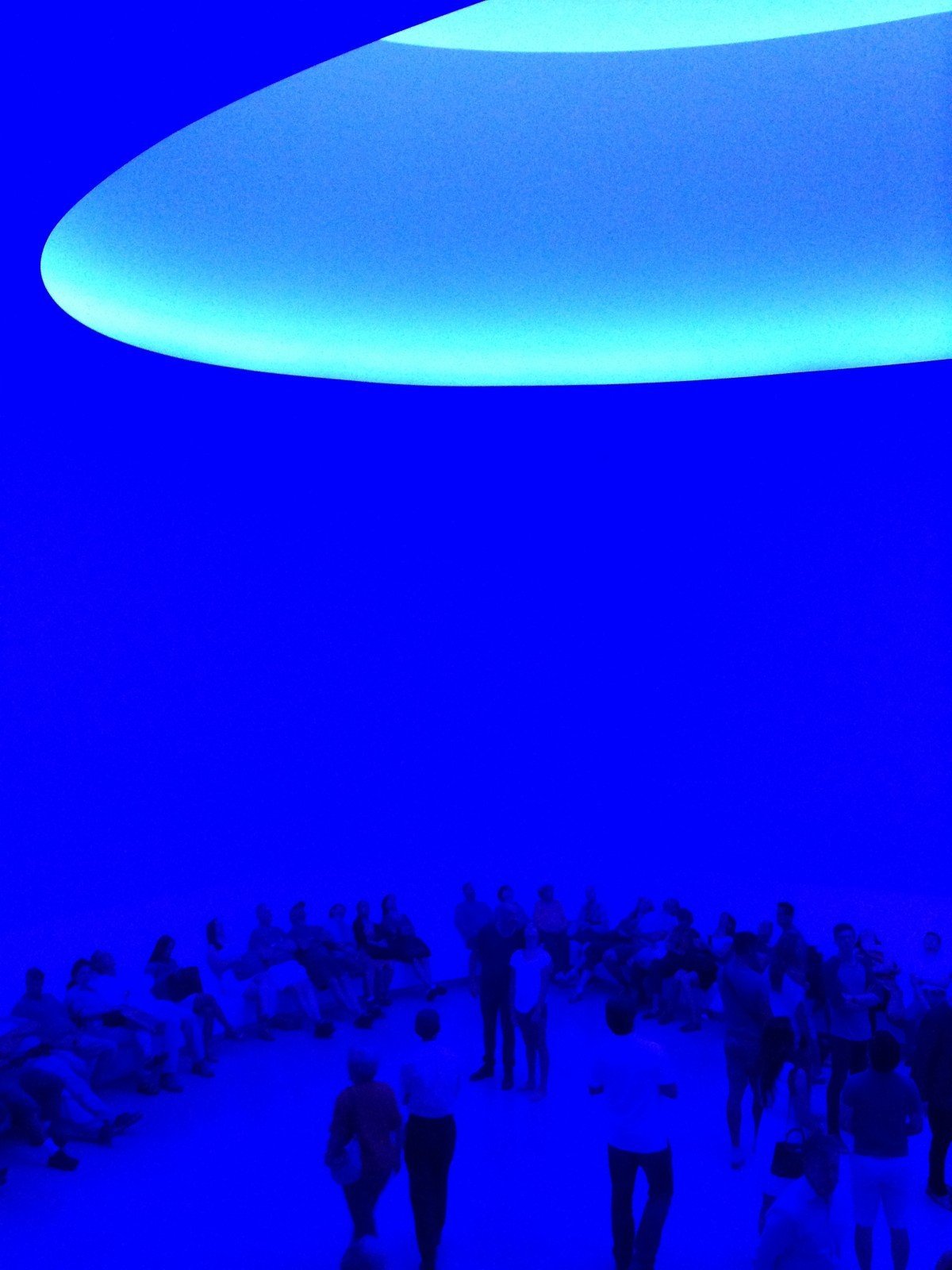
- James Turrell, “Aten Queens”, Installation at Guggenhein Museum, New York, 2013
-

- Vitale da Bologna, “Crucificsion”, detail, 1335 circa, Madrid, Museo Thyssen-Bornemisza
-
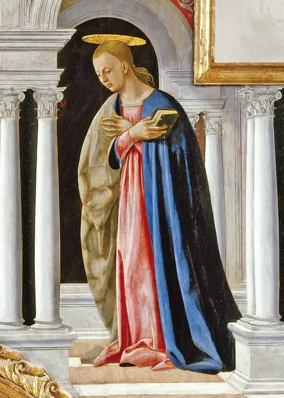
- Piero della Francesca, “Annunciation”, detail from “Polittico di Sant’Antonio”, 1460-1470, Galleria nazionale dell’Umbria, Perugia
-
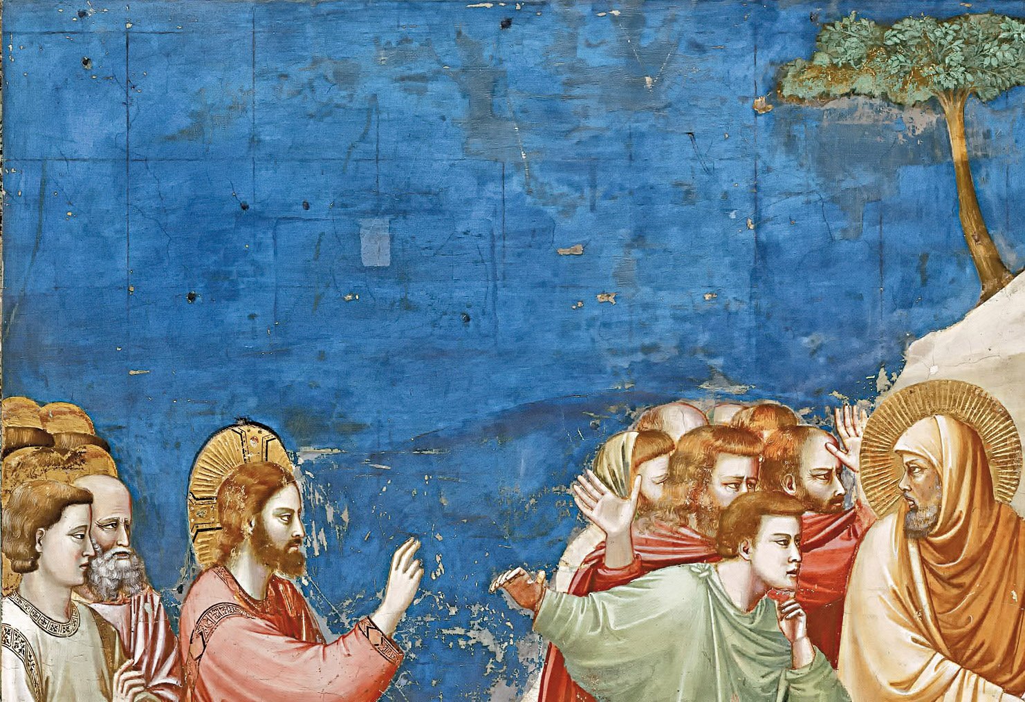
- Giotto, “Resurrection of Lazarus”, detail, 1303 – 1305, Scrovegni Chapel, Padua
-
- YKB Pigments
-
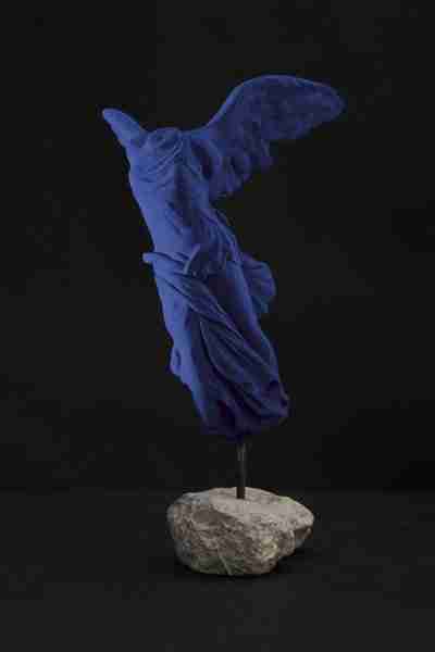
- Yves Klein, “Victory of Samothrace”, 1962, private collection
-
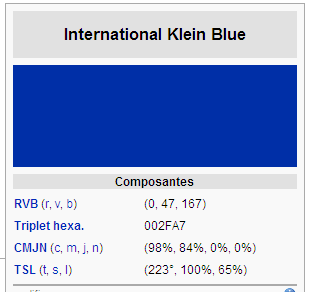
- YKB formula
-

- Screen shot from the film “Blue” by Derek Jarman, 1993
-

- A model perfroming Yves Klein’s “Antropométries”, 1960
The use of blue colour in art, in various eras and different cultures, has always enriched the form of the works with a powerful transcendental charge, both symbolic and conceptual. Its meanings have generally been related to a specific semantic field, that of spirituality. In ancient times, for example, blue was considered the colour of all the gods of heaven, and therefore was used to represent the divine. The blue has been used in most of the medieval and Renaissance paintings to depict the mantle of the Holy Mary, intended as a colour of purity and as a medium that connected heaven and earth, divine and human. In his essay “Della Pittura,” Leon Battista Alberti developed a theory of colour, with a code related to the four elements where the blue corresponded to the air, that is to say the essence of the spirit.
This notion of blue has travelled through time up to our days, reaching artists such as Vasily Kandinsky, Yves Klein, James Turrell, Anish Kapoor, and a movie director such as Derek Jarman. In 1974, this latter come across a monochrome painting by Yves Klein for the first time, and he had the idea of making a film dedicated to the French artist. The film, titled “Blue”, was however released only 19 years later, in 1993, and was the last one signed by Jarman, filmed when he had become completely blind, as a result of complications due to AIDS. The year after he passed away.
“Blue” (currently on display at the Tate Modern in London) is a single frame of blue colour, exactly the shade of “International Klein Blue”, registered by Klein himself. It serves as background to the soundtrack, composed by Simon Fisher Turner and Jarman’s voice that speaks of his life and his artistic philosophy (here is the text). For Jarman this colour embodied his idea of art, that of a rarefied transcendental experience to reach an immaterial and spiritual beyond. This perception reminds to the one that has indeed triggered Klein to research, invent and ultimately use the colour of blue.
In his essay “Concerning the Spiritual in Art”, Vasily Kandinsky addresses this colour too. According to him, any artist has the duty to be aware of the effects produced by the different colours on the viewer. For this reason Kandinsky invited to do exercises in order to learn how to grasp the true intrinsic value of each colour. When it came to Blue, Kandinsky encouraged to observe how this colour “develops a concentric movement (like a snail withdraws into its shell) and moves away from the viewer”. The eye, therefore, necessarily plunges into the depths of this shade. A bottomless depth, which draws our attention into a magnetic manner with no arrival point. It is not a coincidence that the continuous and never-ending tension in the direction of the blue was also compared to the practice of Zen meditation.
“The blue is the typical colour of the sky” Kandinsky writes in his essay, “if it is very dark then it gives you an idea of stillness. If it falls into the black, then it acquires a note of sadness, yearning, sinks into a drama that does not will end. If it tends to lighter tones, which is less than adequate, it becomes rather indifferent and distant, like a high sky. The more light is blue, the less eloquent is, until to arrive at a quiet stillness: the white”. The artist also compares the blue from a musical point of view: “the light blue is like a flute, the blue is like a cello or, when it becomes very dark, to the wonderful sound of a bass; and in its most dark and solemn has the deep sound of an organ”. That is indeed the perfect tool for playing sacred music.
April 24, 2014