
The typographic utopia of Tallone Editore
A journey to the printing atelier of Tallone Editore, where a Renaissance approach to publishing mix with the present
The aesthetic utopia of producing contemporary books with a Renaissance spirit still lives in Val Di Susa, close to Turin in Italy. Since the 1930s, the publishing house founded by Alberto Tallone in Alpignano (Tallone Editore) has made 500 years old printing techniques its signature. Enrico Tallone, son of Alberto, revives today his father’s passion as well as the tradition of the great historical printers and typographers such as Aldo Manuzio and Giambattista Bodoni. Handset and handmade, Tallone books can count on one of the most excellent collections of lead movable types, used to print on rare paper from the most important makers around the world. Their catalog of limited edition titles is where Renaissance and contemporary meet.
[For more about books, here is our list of top antique book dealers, here are our favourite publishers of artist books in Europe, and here is our interview with ancient book scholar Giancarlo Petrella. Ed.]
Yet Tallone books are not just the elitist quirk of a refined bibliophile. To better understand the dream behind this publishing house, we need to go back to 1920s Milan, where Alberto Tallone is a young antiquarian bookseller surrounded by the great protagonists of 20th century art and culture. Alberto’s father is Cesare Tallone, a painter who befriends many of the artists from the scapigliati and divisionismo artistic movements. His circle of friends includes Tranquillo Cremona, Daniele Ranzoni, Giovanni Segantini, Angelo Morbelli, Gaetano Previati. A well-known portrait painter himself, Cesare becomes director of the Carrara Academy in Bergamo as well as a teacher in the Brera Academy in Milan. His painting class is followed by important artists such as Achille Funi, Aldo Carpi, Giuseppe Pellizza da Volpedo and Carlo Carrà.
Many from Cesare’s circle are regular visitors to his son Alberto’s antiquarian bookshop, which also attracts other popular intellectuals, writers, poets and bibliophiles from Milan such as Margherita Sarfatti and Sibilla Aleramo. The latter is very close to the Futurists (she is the lover of Umberto Boccioni) and advises Alberto to open a new chapter in his story with books: not only study and trade them, but also print and distribute them. Following his friend’s suggestion, Alberto Tallone embarks on a new mission. He decides to learn the art of typography and leaves for France to work in the atelier of Maurice Darantiere, the famous art publisher responsible for printing the first edition of Joyce’s Ulysses for Sylvia Beach publishing house.
In the atelier of Darantiere, Tallone works first as an apprentice and later as a type-setter, declaring himself “the happiest worker.” He also brings a new spirit. To the somewhat rationalist style that prevailed in French graphic design at the time, he adds the lightness of the Italian tradition. Tallone is inspired by anti-modernist aesthetic principles, an attitude that is evident in his series Masters of Human Letters edited by Artist Typographers for which he prints masterpieces from each European nation. Among these titles, remarkable is the two-volume edition of I Canti by Leopardi, handset by Alberto and published in Paris in 1934 by Darantiere.

In 1938, Alberto Tallone takes over the atelier of Darantiere to continue his own publishing and printing business in Paris. His print shop becomes a meeting point for intellectuals such as Paul Valéry (of whom Tallone publishes two original texts), Paul Hazard, René Char, Charles De Gaulle, Giuseppe Ungaretti, Eugenio Montale, Aldo Palazzeschi, Salvatore Quasimodo, Ezra Pound, Cesare Pavese. Film directors such as Luchino Visconti and Vittorio De Sica visit it regularly and so do the painters Severini and de Pisis. At the end of the 1950s, Alberto returns to Italy, moving his 18th century Parisian workshop with all its precious collection of movable types to his family house in Alpignano. Because of his presence, this small town becomes a cult destination for popular poets such as Pablo Neruda. Important scholars such as Francesco Flora and Gianfranco Contini become directly involved in Tallone’s publishing projects.
The clarity of Tallone’s aesthetic and cultural project earns him his reputation. In the post-WWII era of industrialization and fast production, where innovation in printing techniques is a daily routine, Alberto Tallone takes the opposite path, that is, craftsmanship and slowness. He stubbornly defends the dignity of artisan typography, an art that is rapidly disappearing. He decides to be the publisher and printer of philologically sound and refined books. Without any frills except those allowed by typesetting ancient characters, he prints and publishes work by authors from Ancient Greece such as pre-Socratic and utopian philosophers, but also Medieval, Renaissance and contemporary writers. Alberto embodies the ideal laid out by 18th century printer Gianbattista Bodoni, according to whom typography is the purest vehicle of thought.
Today, Alberto’s son Enrico pursues the same ideal. He tells us: “Fortunately we have not scaled up. Tallone Editore is still a family business with only one employee. We outsource some part of the work of course, but our small scale guarantees us that freedom and autonomy my father strived for back in France. We want to follow the production of a book from start to finish, which would not be possible if we worked at an industrial scale. We are unique on the international publishing scene. Although there are other artisanal print shops out there, we are the only ones who follow an original Renaissance model according to which the printers are also publishers and booksellers. We don’t make compromises and we never use linotype or monotype to typeset mechanically.”
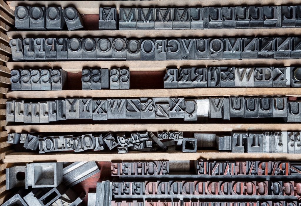
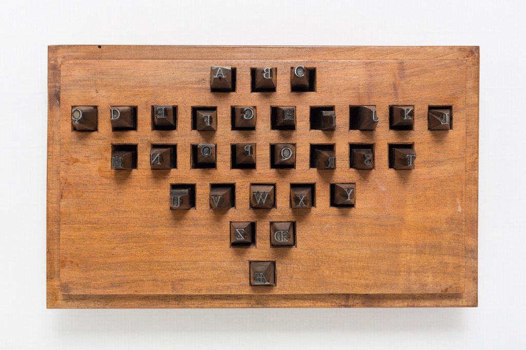
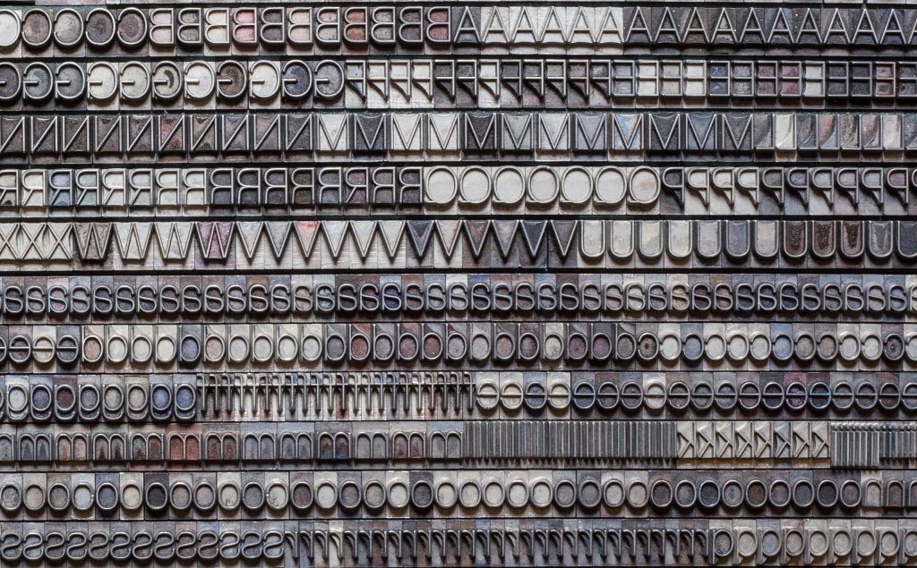
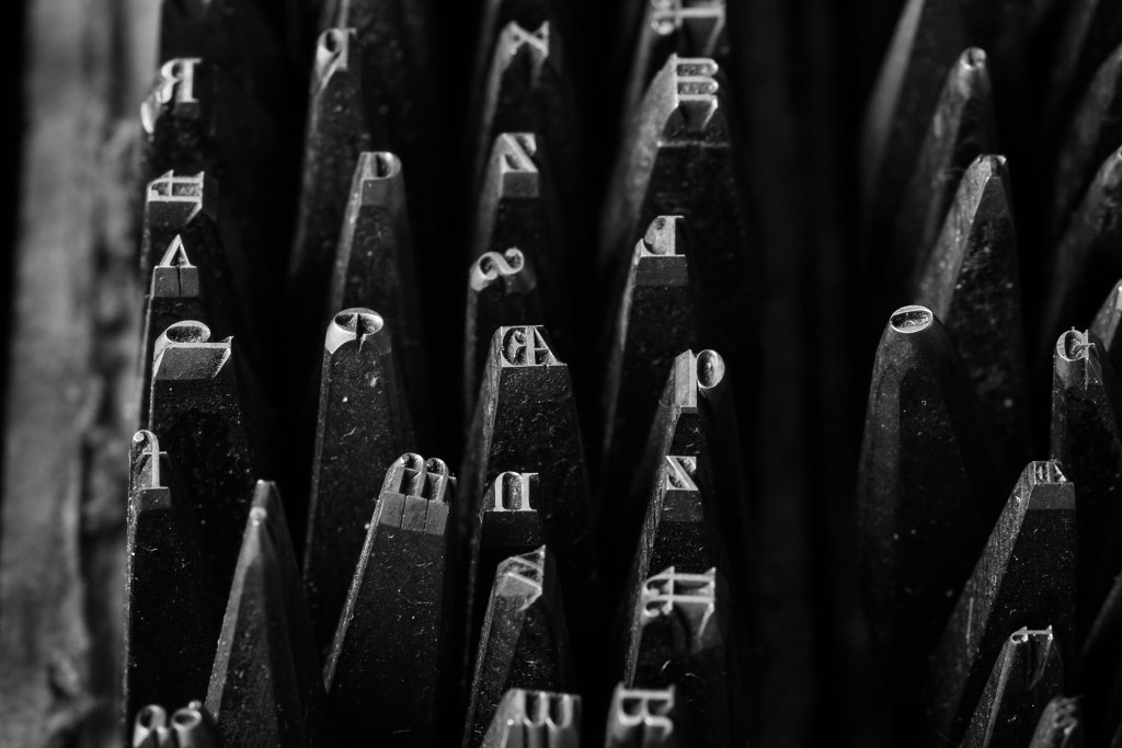
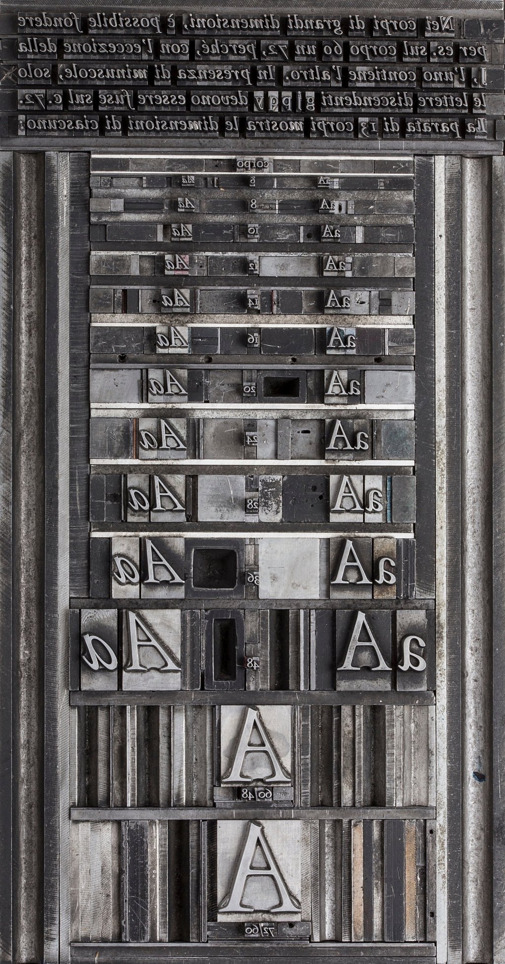
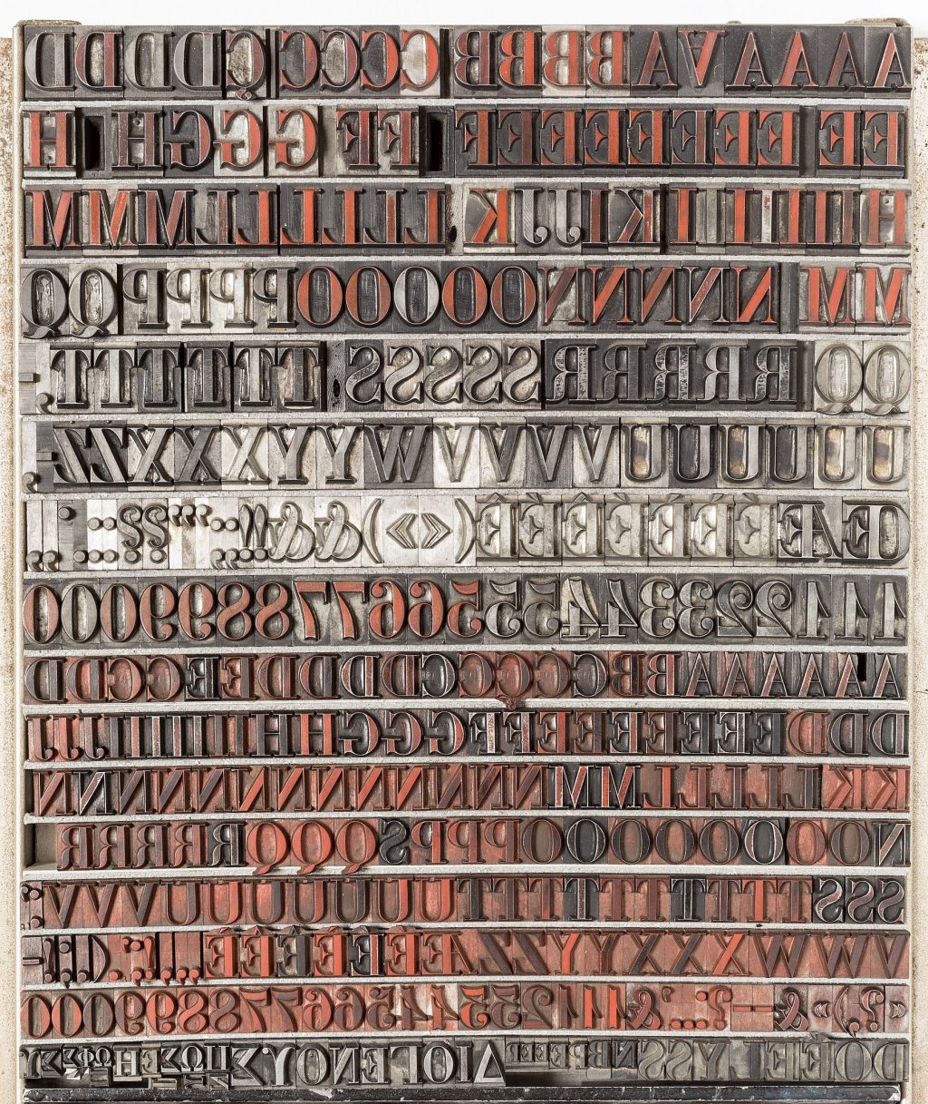
The Alpignano atelier still uses the movable types acquired by Darantiere, some of which date back to the 17th century. Tallone also created its own typeface Tallone, designed and fabricated in 1949 in Paris by the engraver Charles Malin. The font is a graphic synthesis of classic elegance and timeless essentiality. It is absolutely modern despite its archaic nature. Together with their Caslon (English characters from the 18century) and Garamond (fabricated in France in the 20th century by Deberny & Peignot), the typeface of choice for the publisher is still their original Tallone font.
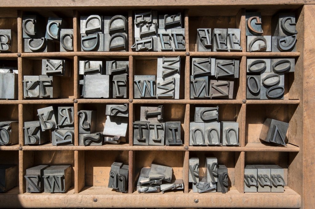
“Our characters are individually cut by hand on a steel punch, just like those used by Manuzio or Bodoni” specifies Tallone. “This choice comes with little imperfections in the resulting print, which however add value to the page. They make the text warmer and into a sort of calligraphy. The engraver proportioned each character according to its body. In the very small bodies of the Tallone typeface for example, the empty eye of the ‘e’ is proportionally larger than that of a larger body, which would overflow with ink. This proportioning means that each body is always created following a specific idea and to create a very precise graphic atmosphere. It also means each printed character is never a clone of itself. Digital typography and setting give perfectly equal but soulless characters.” Just like William Morris decades earlier in England, Tallone Editore brings back the great craftsmanship and absolute quality in book making, aware however that artisanal printing is never an end in itself. “The most important focus in our work is always on the text and philological rigor. Typography must only serve the text, without any graphic frills” explains the publisher.
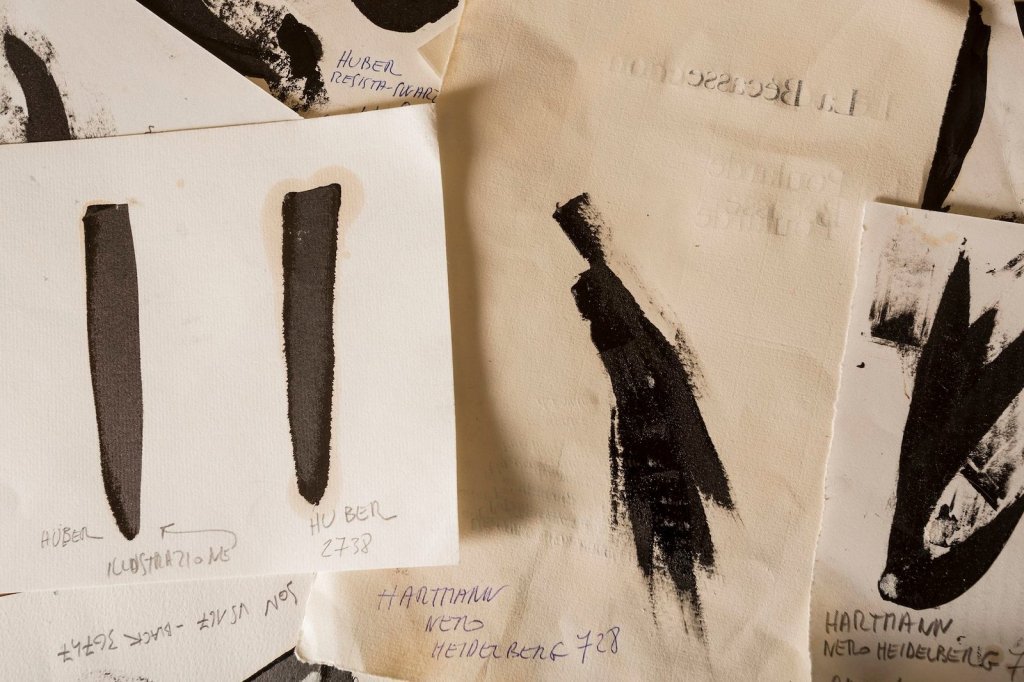
In this art of ancient printing, ink also plays a crucial role. Its wrong dosage can take away from the pleasure of reading. Tallone uses a mix of brown pigments from a collection of over 100 hues. Some of them together are perceived by our eyes as a “pleasant and bright” black as opposed to a “mournful” pure black. Last but not least is the paper, which Tallone has always sourced from around the world. The publisher used a specific Japanese paper in the 40s and 50s until it went out of production. A little stock of it, which thanks to its “lightness makes the book levitate” is now jealously guarded in the atelier. Besides the Japanese paper, Tallone’s 300-type stock also includes French Canson paper by Montgolfier (the same used by Eugène Delacroix, Matisse and Picasso and considered “the sublime one”), Chinese bamboo paper, and the traditional high-end Italian papers such as Fabriano, Pescia, or Amalfi.
Tallone Editore represents today a continuity in the history of printed matter. Their philosophy is that the typefaces, typesetting, inks and paper should all contribute to a clear and non-dazzling page, which should be warm, manageable, and making the text stand out so “human thought can take shape.” For example, the results of this philosophy can be seen in the Discorso sull’indole del piacere e del dolore by Pietro Verri, the latest book produced in Alpignano.

In recent years, contemporary artists such as Giulio Paolini, Giuseppe Penone, Mimmo Paladino and Claudio Parmiggiani have also collaborated with Tallone for their editions. Moreover, the publisher also keeps an eye on modernity through his Archivio degli Stili, a repertoire of those typefaces from the 20th century that have entered collective memory thanks to advertising and mass communication.
“These 20th century types have all been digitized and because of that they have been modified. They are now some kind of ghost, simple photographs of what they are. We keep those types as lead characters here, so they become little sculptures of thought, strongholds of signs. It is thanks to these typefaces that the aesthetic thinking of the 20th century took shape. Alongside our ‘classic’ fonts, we have therefore created this archive of typographic modernity for the use of students and passionate graphic designers. These simple signs printed on paper are the basics of our work as a publisher but also small conquests of our civilization.”
February 22, 2021