
In between language and drugs: Michael Dean + Jac Leirner
Two shows that took place in London put accidentally side by side Michael Dean and Jac Leirner. Here is why this encounter was so meaningful.
Michael Dean at South London Gallery
To access Michael Dean’s exhibition at the South London Gallery, and Jac Leirner solo show at White Cube, one has to explore the labyrinth-like, domestic environment of the building to find a way in. Occupying the gallery’s main space on the ground floor, Michael Dean blocked the regular entrance of the room with a voluminous white material, offering but a glimpse of the interior from the outside. From the inside, this sculptural prop acts like a mediator between the architecture and the group of works on show: its colour harmonises with the original features of this bright Victorian conversion whereas its formlessness points towards the artist’s unmistakable style. Titled Sic Glyphs, the show contained a series of semi-abstract sculptures with a shared human scale, displayed invariably from the floor throughout the exhibition space. Making use of a lean set of materials such as concrete, coins or naked steel, the artist shaped each of these pieces uniquely, further populating the floor with small objects which seem to derive from the bigger sculptures. It somehow felt like being inside a saloon, a social gathering of odd beings where you make small talk with one character and soon move to the next for another quick chat.
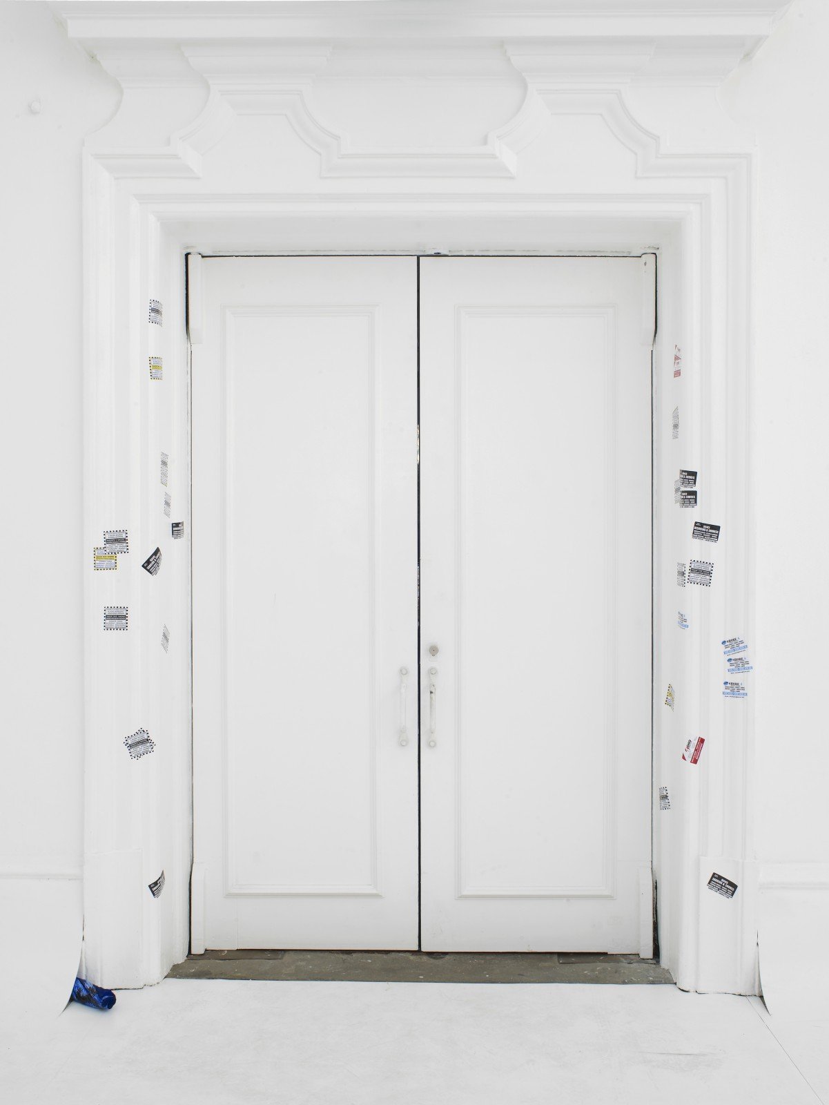
‘Sic’ is a term widely used and misused in texts to indicate that a word was transcribed exactly as it was pronounced, often indicating some sort of typo. A ‘glyph’ in typography, is ‘the specific shape, design, or representation of a character’; or the qualities that make a given letter recognisable over different typesets. Thus Sic Glyphs seems an apt framework for objects that share a similar conceptual origin, scale and matter while being individually one of a kind. Michael Dean’s longtime interest in language and typography – reportedly, he creates typefaces since his teenage years – was further evident in a series of stickers glued randomly around some of the room’s various doors. Bearing different designs, they repeated the letters E H O R S exhaustively, most prominently forming the word SHORE but allowing myriad phonetic associations and variations, particularly to an anagram-driven mind. We attempted to leave through one of these doors, but were prevented to do so by an invigilator. As in a guessing game, it didn’t offer a clue on where to go, but to avoid being reprimanded once more, we left by the same route we’ve entered. Michael Dean’s practice is idiosyncratic in that it is generous and mysterious at once, concealing as much as it reveals: you are encouraged to move and interpret objects freely – and often even to take elements from his exhibitions home – yet he will not guide you to the right door, nor share the codes that will allow the viewer to decipher his incomprehensible – albeit methodical, it seems – language.
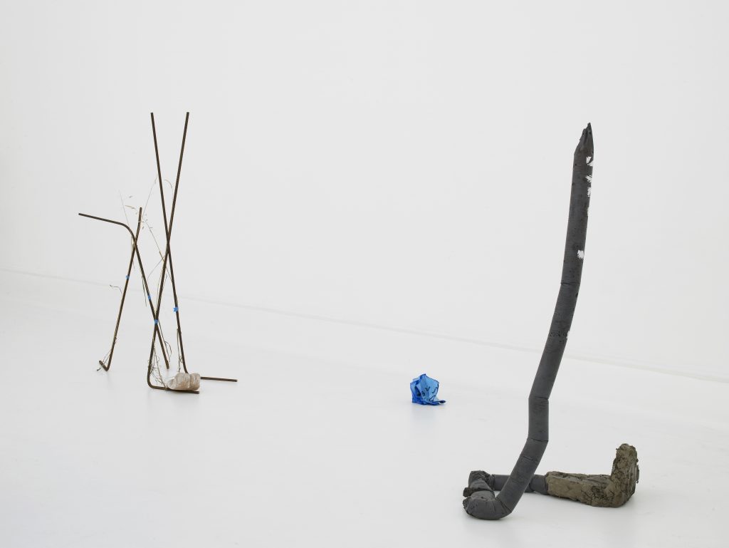
Michael Dean, Sic Glyphs, installation view at the South London Gallery, 2016. Courtesy the artist, Herald St, London, Mendes Wood DM, Sao Paulo, Supportico Lopez, Berlin. Photo Andy Keate. 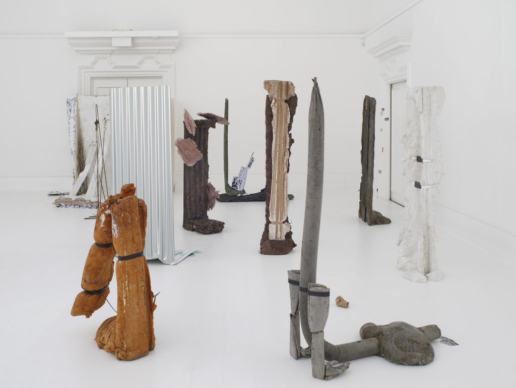
Michael Dean, Sic Glyphs, installation view at the South London Gallery, 2016. Courtesy the artist, Herald St, London, Mendes Wood DM, Sao Paulo, Supportico Lopez, Berlin. Photo Andy Keate. 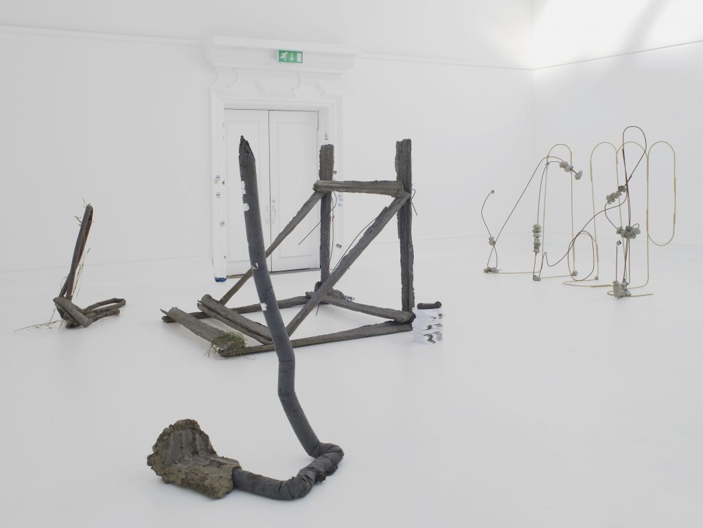
Michael Dean, Sic Glyphs, installation view at the South London Gallery, 2016. Courtesy the artist, Herald St, London, Mendes Wood DM, Sao Paulo, Supportico Lopez, Berlin. Photo Andy Keate. 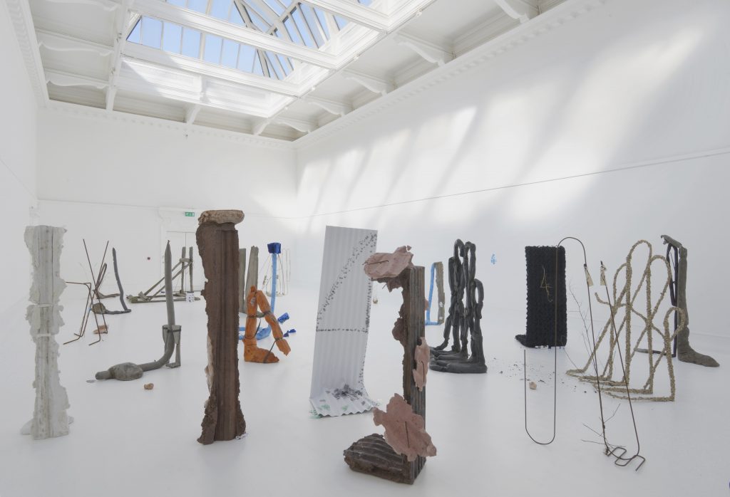
Michael Dean, Sic Glyphs, installation view at the South London Gallery, 2016. Courtesy the artist, Herald St, London, Mendes Wood DM, Sao Paulo, Supportico Lopez, Berlin. Photo Andy Keate.
Jac Leirner at White Cube
From south London to Mayfair, Jac Leirner’s Junkie at White Cube Mason’s Yard presented sculptures and photographs which, as the title explicits, related to her drug-consuming years. On the lower ground floor gallery, Jac Leirner exhibited some of the two thousand pictures she took during a seventy-two hours cocaine binge in 2010. These were printed in small formats and arranged in lines over plywood boards – accumulation has always been Jac Leirner’s distinct trademark – exhibited horizontally in non-linear gatherings one on top of the other. They reveal close-ups of cocaine sculptures that the artist has meticulously casted – a head, a heart, a snowflake – each photograph presenting a unique perspective and composition. The pictures are further inhabited by materials that at times allude to a domestic environment, at times to a drug using one. Intertwined in these gatherings were wall sculptures that, sharing a similar formal structure as of the photographs, aligned objects such as cigarette papers and cigarette boxes. It was a powerful and courageous body of work, in spite of the fact that the artist has always been quite open about her drug issues, a universe that has already been present in previous series of work.
Jac Leirner, The End, 2016. Steel cable, paper, cardboard, plastic and spirit levels. Dimensions variable. Photo: White Cube (Ben Westoby). 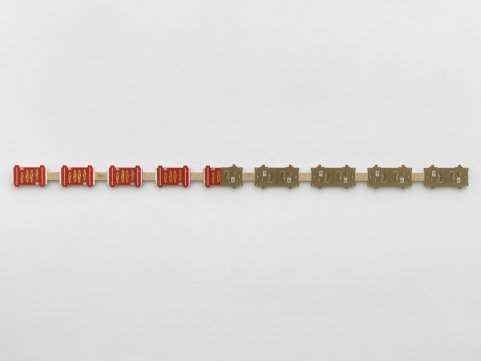
Jac Leirner, Middle East, 2016. Rolling paper packaging on plywood. 5 7/8 x 113 3/16 x 13/16 in. (15 x 287.5 x 2 cm). Photo: White Cube (Todd-White Art Photography). 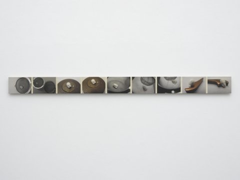
Jac Leirner, Metal Situation, 2016. UV inkjet print on plywood. 4 3/16 x 55 11/16 x 13/16 in. (10.6 x 141.4 x 2 cm). Photo: White Cube (Ben Westoby). 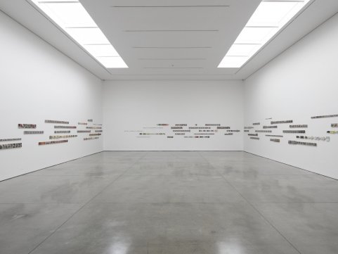
General view of Jac Leirner’s Junkie,2016. Lower ground floor gallery. Photo: White Cube (Ben Westoby).
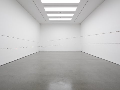
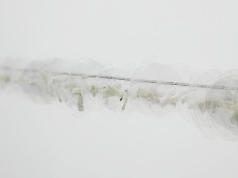
If the lower ground floor was devoid of tridimensionality, volume found its way in The End, the majestic installation exhibited on the ground floor gallery. Reminiscent of Fred Sandback’s seminal aesthetics, the artist hung four steel cables that cross the space from one end to the other, inviting the viewer to lean-down and cross wires to experience the installation from a central perspective. Each of the cables contained a series of similar objects: rolled papers which once served as improvised filters for joints, presenting burn marks in one end; the small bits of rolling paper that are cut out before lighting a spliff, here pressed between plastic circles, and other objects which pertain to a junkie vocabulary. Though in their majority these ephemera dates from the mid-1980s, they have became an artwork, and to look at them through this time capsule perspective added yet another layer of meaning to the installation. Jac Leirner has reinvented herself several times throughout her career, and to show an entirely fresh group of works after more than thirty years of production was a gift few artists posses. Don’t let yourselves be fooled by the title; in effect, this couldn’t be further away from The End.
November 17, 2022